
ILLUMINE
A website for a new movie theater company, Illumine, where users can view movie showings and purchase tickets online in the comfort of their homes or while on the go. Defining these problems will help provide alternatives or solutions during those stages of the user journey.
Program: Adobe XD
Duration
MAR 2023 - APR 2023
Roles
Lead UX Designer and Researcher
Responsibilities
User and Market Research. Wireframing, Analysis and Iteration, and Rapid Prototyping
Brief Overview
Problem
There were many instances where moviegoers would complain about the lack of attention these entertainment companies put into their websites. Some talked about the abundance of text, ad-promoting memberships, or event listings that made their experience overstimulating.
Goal
Our movie theater site will let users efficiently purchase tickets no matter what user journey they have or navigations that they’ll use. The site will also limit content on each page to only those that help complete a user flow and additional content provided in other menus.
Why Research At The Start?
The importance of my user research is to understand each participant’s lifestyle and how it plays a part in how someone interacts with other entertainment sites. Learning about their behaviors and experiences will help bring more inclusivity to the site with awareness of different life situations. I want to understand the struggles rarely addressed and any missing pieces that need attention.
Pain Points
-
Hidden fees or prices for movies after the user has entered information for their order
-
Too many options for locations, just want to have the few locations closest to the user or under a certain amount of miles
-
Most sites don’t include descriptions for different viewing modes, which makes users have a difficult time choosing a viewing version
-
Getting overwhelmed by the many packages and memberships the site is trying to promote. Distracts users from their goal (Difficult, time-consuming, confusing)
"When I click on a movie, I get a huge list of locations that are currently streaming the movie. I'd love to know where it is depending on my location and not scrambled in with options at other theaters."
- Participant B
"It’s a little annoying when some websites would make you enter personal information or standard customizations for your order before you see the ticket prices."
- Participant C
User Personas/Journey Maps
With the data I collected from the user research, I created user personas to humanize real-world problems based on the pain points above. Also, including each with a problem statement was a great way to help me quickly summarize their concerns and general backgrounds. The same idea was applied when creating a journey map to help pinpoint their potential steps, which could reveal new issues that I overlooked or find solutions in each task of their journey.

“It’s a little annoying when some websites would make you enter in personal information or standard customizations for your order before you get to see the price.”
Goals
-
Give users pricing information before seat reservations and payments
-
Results solely based on user’s selections
Frustrations
-
Wants to make the most of her time with the ordering process
-
Retrieve information only specific to her search customizations
Grace Choi
Age:
Education:
Hometown:
Family:
Occupation:
18
Cordova Highschool
Sacromento, California
Mother, Father, Brother
Highschool Student
Grace is an 18-year-old student who is currently attending her last year of high school in her hometown of Sacramento. She is a very extroverted individual and spends a lot of her time with her friends after school. This also means that she needs to be self-aware of how much money she is spending. She has planned to go to the movie theater with her friends and hopes that it’s an easy process to reserve seats for a large group of people.
Persona: Grace's Journey Map
Goal: Enjoy a movie night with friends afterschool
“When I choose a movie, most of the time, they always have different viewing versions like 3D or IMAX, but it gets so confusing that I don’t even know the difference between each one.”
Goals
-
Information symbols that give explanations of each viewing version
-
Limit membership presentations, keep it simple with one category
Frustrations
-
Doesn’t understand the difference between movie-viewing versions
-
Bombarded with advertisements about theater's premium subscriptions

Diego Montgomery
Diego is a 47-year-old bank teller who lives with his wife and two kids in his hometown of Lansing, Michigan. He has a typically 9-5 job and wants to put more effort into spending time with his family during the weekends. This is his first time purchasing movie tickets online. Many movie theater websites are very cluttered with information and membership promotions. He hopes to have a smooth ordering process without all the extra information.
Age:
Education:
Hometown:
Family:
Occupation:
47
Purdue University
Modesto, California
Wife and two kids
Bank Teller
Ideating Design Solutions
To start coming up with ideas to address some of the pain points gathered earlier, I conducted a competitive analysis to learn more about how other competitors in the industry form their online presence and prioritize the needs of their users. "How Might We's" and "Crazy Eights" were also great techniques to get into brainstorming ideas without limitations or concerns about the final designs.
Competitive Analysis
The purpose of my market research was to collect data from both direct and indirect companies to understand the users' experience exploring their menus and completing their orders on competitors' sites. I want to know what works or doesn't work well for each of their site experiences, so I can pinpoint specific issues or missing information that I can improve on.

Regal Cinemas
Direct Competitor | $$
Movie Screenings with fast food dining options
Strengths
-
Easy to browse movies with most anticipated movies and other categories on the bottom
Simple to browse through the app and get more info about food options
-
Home screen offers many carousels for each movie category as easy access for users

IPIC Theaters
Indirect Competitor | $$$
Premium Wine and Dine Showing
Strengths
-
Great detailed information about each type of seating they offer
Real time drive time to each location
-
Friendly and welcoming (introducing themselves and their services)
-
Clear progression of ordering tickets with icons and color contrast to help guide users

Alpine Cinemas
Direct Competitor | $
Movie Screenings with fast food dining options
Strengths
-
Ability to check loyality points for special offers
-
Big display of current anticipated and upcoming movies
Weaknesses
-
Alot going on in navigation bar, needs better way of categorizing information
-
Screen for movie trailer is a great feature but I can't access exit button on top right of screen, had to close app and restart
Weaknesses
-
Not a fan of the low quality images especially when displayed so large, decreases the design quality of the site
-
Information of movie takes up more space on the screen compared to showtime selection
Weaknesses
-
No clear navigation menu bar, links to menus and reservations are on the body text
-
Text are very small for both descriptions and ordering screens
-
No navigation bar on any screen
Site Map
Unlike a mobile app, websites tend to include additional information about their services but could complicate your process if all the content isn't organized and planned out correctly. Creating a site map gave me a feeling of reassurance because it allowed me to see what pages I needed and subcategories that needed to be worked on or left out for visual purposes only. The map also made it easier for me to sort my content for mobile screens to make the site responsive. I would typically have this map on the side as a reference throughout my design process.

Crazy Eights and How Might We's
"How might we show ticket prices before user begins the ordering process?"
"How might we further assist the user after reserving seats and placing order?"
"How might we help users easily plan their ticket reservations in advance?"
Let's Get To Drafting!
During the beginning of the sketching process, I thought about each iteration of the pages for different screen sizes, which made the process more time-consuming than expected. But, I considered making some changes that kept the desktop and tablet screens too similar, just with fewer columns to fit the screen. It helped keep my site simple with fewer jarring changes when users change their screen size.
Desktop Screens

Homepage

Movie

Theaters

Ordering

Movie List

Food
Tablet Screens

Homepage

Movie

Theaters

Ordering

Movie List

Food
Mobile Screens

Homepage

Movie

Theaters

Ordering

Movie List

Food
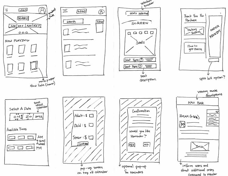
Paper to Digital Wireframes
Choosing seats are also on the same page next to the ticket details
Prices and ordering tickets simultaneously. Order details on top so users can double check their customizations

This addresses users’ concerns about experiencing hidden fees while purchasing. Users will be allowed to browse through locations and times before they reach the pricing, which will also include information for seating on the same page. Personal info and payment will be requested toward the end of the user flow.
Location customization to generate location distances
Ordered from closest to furthest less than 3 miles from address

This addresses users’ concerns about overwhelming amounts of information when it comes to making a decision. GPS will take your approximate location or entered location to list out location within a 3-mile radius in the order of closest to furthest.


Low-Fidelity Prototype
This flow simulates a standard user journey flow who wants to order tickets and create seat reservations for their selected movie ahead of time. The end of the user flow will also include the next steps to continue aiding their users after their journey.
Check Out The Prototype Below

Lo-Fi Usability Study
I conducted a usability study with 5 participants, each with individual interviews. They were given a variety of tasks to address specific parts or features of the app, like “Pick a time to see the movie. Try to edit order details in the cart and make it back to the cart. ”, “Try to place your order and purchase the tickets.” and etc. Breaking up the tasks of a typical user flow will help keep me organized and pinpoint problem areas for each action they make.
Method
-
Date: March 15-16 (remote)
-
KPIs: Conversion study and User Error Rate Study
-
Participants: 5 participated with individual unmoderated user testing (ages 16-50)
4 out of 5 participants were confused/frustrated trying to go back to previous screens to make changes to their order
2 out of 5 participants wanted to be able to change dates and locations
5 out of 5 participants commented on the positive impact bolded action buttons on text had to their experience
2 participants pointed out the lack of editing capabilities with their cart, changes made similar to comments on the back button options
Participant D
"I feel like people should have the option to edit their dates since most people would be booking tickets in advance."
Participant E
"It would be very helpful if a back button was added on all the pages where you add information for payment and cart details. If I was actually purchasing tickets I would've needed to start my whole ordering process from the beginning."
Let's Make Some Changes!
Included new back buttons for every step of the ordering process. Descriptions were added to the mockups to help inform users what page they will be brought back to.
*Desktop Screens*
%20%E2%80%93%205.png)
%20%E2%80%93%2013.png)
Added editing abilities for the movie page (second usability cart encouraged the simulation of this feature on prototype, which has now been modified).
*Phone Screens*


High-Fidelity Prototype
Addition of a new color palette, animation upgrades to interactive buttons, and minor tweaks to the placement and sizing of elements.

Hi-Fi Usability Study
The same usability study will be conducted on the high-fidelity prototype to help our data remain consistent with the results I gathered from the first usability study. For this round of user testing, I decided to also think about the actions they make that the participants don't comment on. It's helpful to understand their whole user flow and identify what the majority are led to. These changes prioritize the users even without them mentioning it.
Method
-
Date: April 2-3 (remote)
-
KPIs: Conversion study and User Error Rate Study
-
Participants: 5 participated with individual unmoderated user testing (ages 16-50)
4 out of 5 participants wanted more information about the different viewing modes
3 out of 5 participants tried clicking on the date modification on the movie screens
4 out of 5 participants felt the need of an additional feature for help
2 out of 5 participants mentioned the attention put to the confirmation page
Participant A
"Aren't IMAX and 2D somewhat the same features? I don't know which to choose."
Participant C
"Is there any way to get more information for help whether it's with the site or movies?"
Let's Make Some Changes!
Screening mode info descriptions have been added to provide more information for the user.


Added interactive features to the help button which will be available on most of the pages on the site.
Accessibility Considerations
1
Used WebAIM to determine high color contrast between text/action buttons and background elements
2
Information is limited as much as possible to only important content to decrease distractions from the user’s main goal
3
Use of iconography like the help button displayed on a fixed position for every page. Allows users to receive guidance at any point of their journey
Final Design System
I wanted to keep color themes that adhere to a theater environment, which typically consisted of deep shades of red at most locations, but also come up with something different compared to all the current theaters. Reds have a more prominent contrast with blacks, so they tend to stand out and become brighter with a dark color. I went with a dull shade of green which pairs well with the light pale yellow and gives Illumine a more calm/soothing identity. I decided on a dark shade of gold to help several interactive features on the site attract the user and give the brand a luxurious feel to ensure its top-tier services to its customers as well.

Final Thoughts
Impact
Although this app hasn’t been tested in the real world, conducting usability and market research has helped narrow down the most important concerns and created solutions for users for this new site. Incorporating guidance at the end of the user journey was another way of going beyond the site to care for our users.
What I Learned
This was my first project diving more into creating animations and interactive features for the site. Compared to the first project, I am more capable of visualizing how certain elements would interact with the rest of the content shown on the page. It has also helped me experiment more and discover new opportunities in UI design.
What Next Steps Would I Take In The Future?
Explore new and creative ways to structure my information and consider how to incorporate these designs accordingly with responsive web design
Be better prepared when trying to include new features onto the site (Be more aware of negative space ahead of time to avoid issues introducing new elements on a page)
Simplify information while note taking and focus more on the common or significant issues (if second round of research is needed). This will help avoid distractions by organizing your research ahead of time
